Rail Mate

UPDATE:

  1. Application now available on Windows Store in India And thanks again people who gave their valuable comments. :)

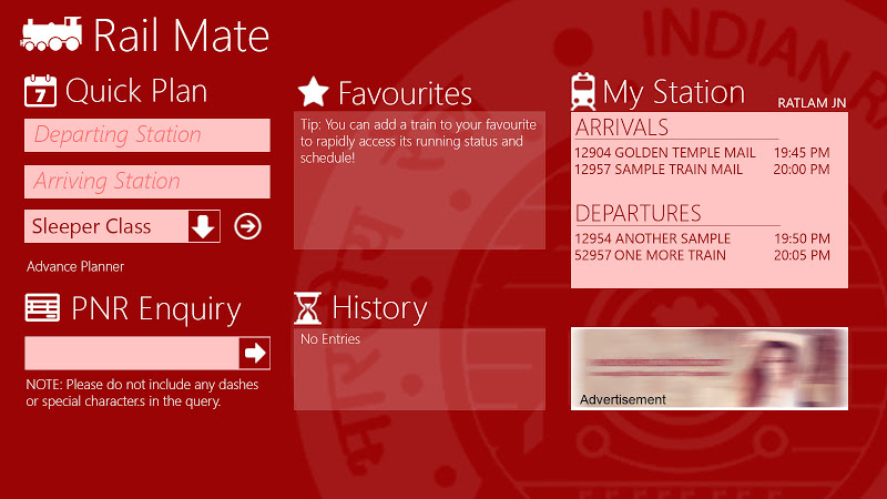
  2. As suggested by most of the people in comment to tweak the user interface. After investing a lot of time, designed a new interface with some more features. The new user interface is also uploaded as an screenshot. It is JUST A PHOTOSHOP MOCKUP and NOT the interface itself. Just wanted to make sure that this thing looks better. Well even I feel I should switch to a different colour scheme which perhaps would be opinion from many like a blue theme but as the Indian Railway website was designed around Red & White as their primary colours, I might stick to same. Feedback welcomed about the new theme and the way I could actually make it more interactive.

  3. Also integrated a small advertisement which I felt was indeed necessary as the application relies on a custom made web service.

Link to the beta upload: http://sdrv.ms/UrUrVB

About the Application: Rail Mate is an unofficial Indian Railway inquiry application which can ease your life if you are a frequent traveler.

Features:

  • Querying PNR Status.
  • Planning your trip and checking the seat availability with full fare information.
  • Getting live train status with up to date arrival and departure information of any train.
  • Getting the train schedule.

NOTE: It is the first revision, Would update it with time.

Coming Soon: Live Tile Support for Train Schedules, Live Status, User Interface modification and other optimization. :)

Feedback Appreciated and NEEDED of course :)

This is my first application and would really appreciate feedback from the talented and experienced developers over here. :) Too crucial for students like us. :)

Vote of thanks to Microsoft and Stack Overflow for this contest. :) All the best everyone!

Screenshots

Comments

0utsmart Dec 6 '12 at 12:09
will be very useful..always had this idea but never implemented it..please put a demo video also..it is needed for the contest.
AlexDrenea Dec 6 '12 at 6:18
Is the app flexible enough to accomodate different Railway companies in the future? like Amtrak in USA ?
Sandeep V Dec 5 '12 at 11:30
Useful app, good work :)
Software Developer Dec 3 '12 at 17:47
Don't forget to post a demo video to be eligible for prizes.
Abhinandy Oct 28 '12 at 5:42
yOU R wELCOME............
Amal Dev Oct 6 '12 at 6:04
Hi Buddy, Nice Work. For me Train Live Status is not showing data sometimes. In such cases it will be nice if you show some sort of info to the user. Also you need to do some styling and formatting so that controls are aligned properly, size of textboxes in Plan Schedule are changing when you type text. Also try to include auto complete in places where you type in Train #
Gaurav Chouhan Oct 6 '12 at 10:26
Hi, Thanks for the feedback.. The Indian Railway website sometimes behave unexpectedly. Maybe that is the reason for the error. Anyways me myself experienced this problem and would check it when the application is uploaded to Windows Store in a week or two. Thanks again. :)
Mamta Dalal Oct 5 '12 at 4:55
Great idea, this would be really useful to the public. As others have suggested, do look into altering the color schemes. This link might be useful to you in this regard: bit.ly/PGZQcO
Gaurav Chouhan Oct 6 '12 at 10:26
Thanks for the link would go through it. :)
vignesh4303 Oct 1 '12 at 8:00
have you added statistical updates ,suppose if the train is 2 hours late the end user can be easily prepare himself for the train ,if you already implemented what i mentioned please provide the screenshots
Gaurav Chouhan Oct 4 '12 at 4:07
Haven't added yet. But yeah! I plan to add it soon. Along with a live tile and toast notification support so that he/she can track the current status of the train. :) Thank you for feedback :)
1
gyurisc Oct 1 '12 at 7:25
Color scheme and background image is very distracting
Gaurav Chouhan Oct 4 '12 at 4:09
Thanks for the feedback. I felt a bit the same but the thing is I tried to match the primary colours of the official Indian Railway look and feel. I felt it was pretty good to begin with. No doubt I would make the User Interface more appealing as it is the prime part of user experience. :)
1
Prince Ashitaka Sep 30 '12 at 13:15
Colors need to be changed to metro range. Background image needs to be changed as well. :)
Gaurav Chouhan Oct 4 '12 at 4:11
Hi, As replied above the current colours were just to imitate the look and feel of the official website portal. Any suggestion about the colour range are welcomed :) Background images would be updated to vector graphics from the simply JPG images later :)
Abhinandy Oct 9 '12 at 4:06
Great work Man!!! :-)
Gaurav Chouhan Oct 9 '12 at 15:33
Thanks for the feedback..! :)