Notepad Classic

This app was a candidate in the Apptivate.MS semi-finals. See how it did among the other candidates in the Work group.

Introduction

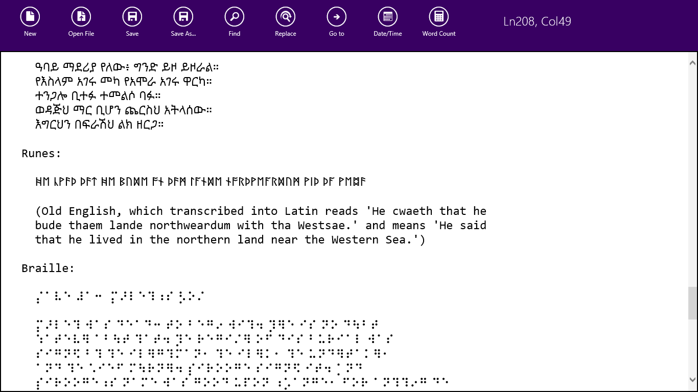
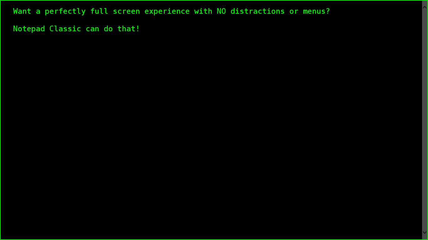
Sometimes you just need a simple tool, for a simple job and while Microsoft offers the FANTASTIC OneNote MX available for Windows 8 to use, it may is just too much. With that in mind, let me introduce a simpler text editor, NOTEPAD CLASSIC! Notepad Classic is that - a simple text editor! Enjoy

Features

  • Support for Unicode & ANSI file formats.
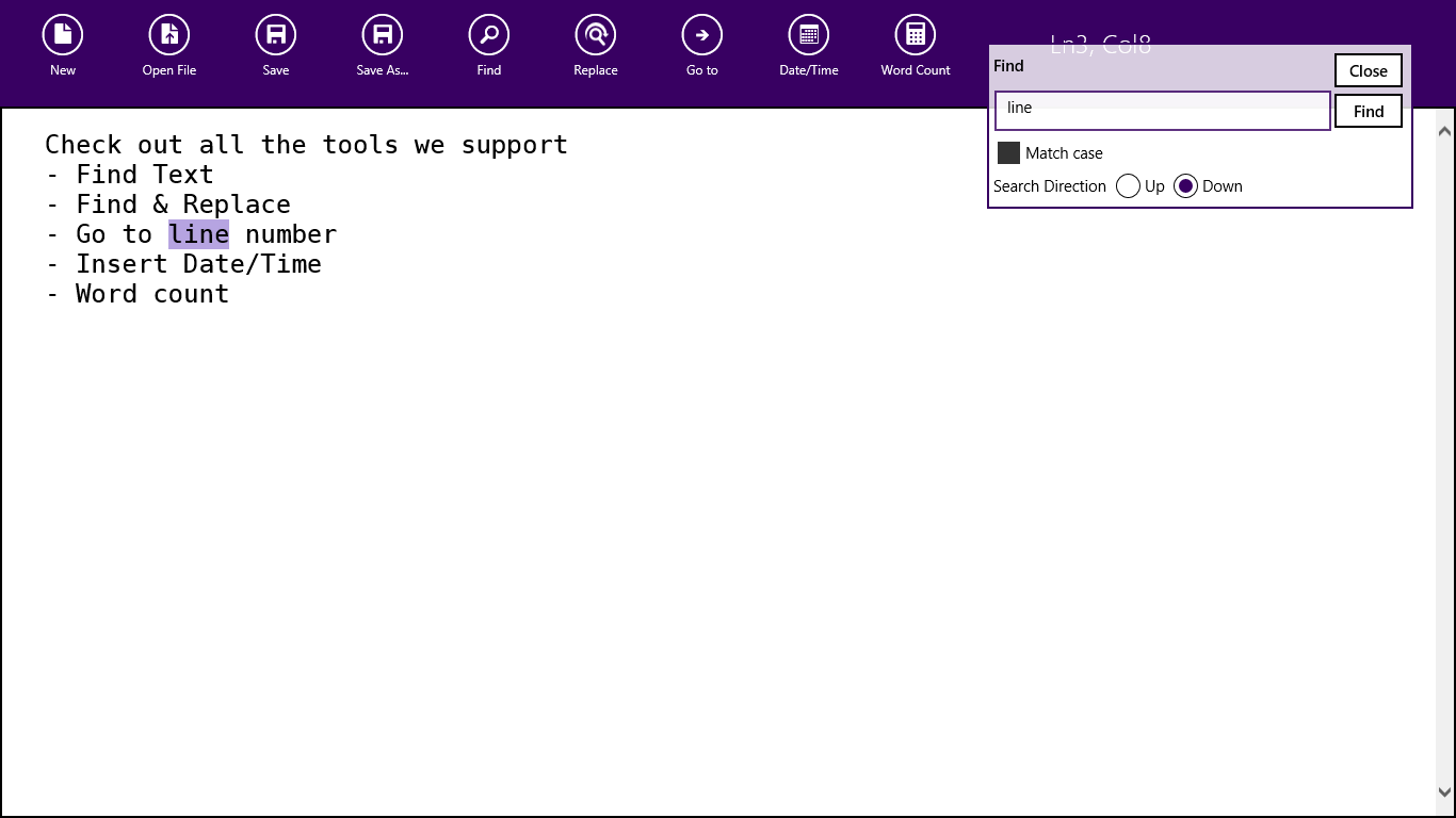
  • Find support
  • Replace text
  • Go to line number
  • Word count
  • Line & letter status position
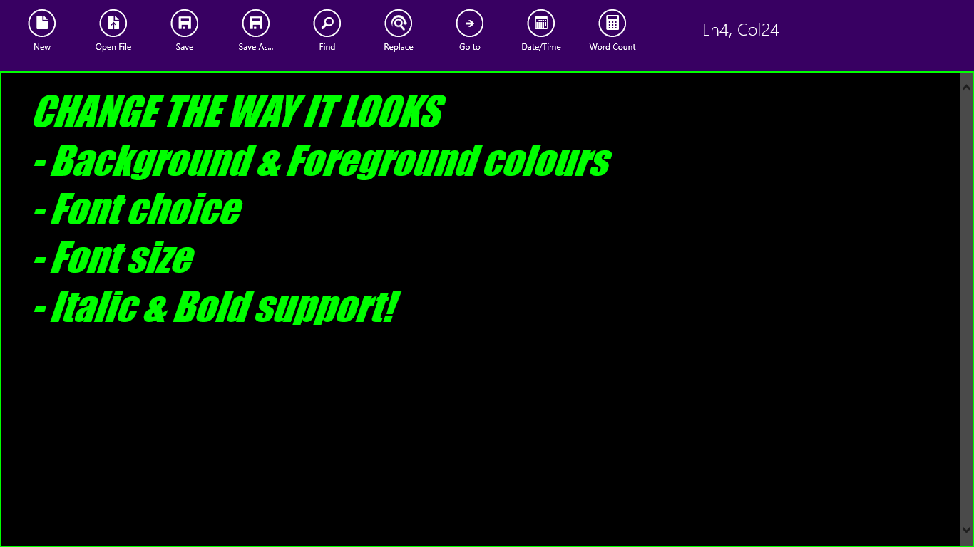
  • Ability to change colours & font settings
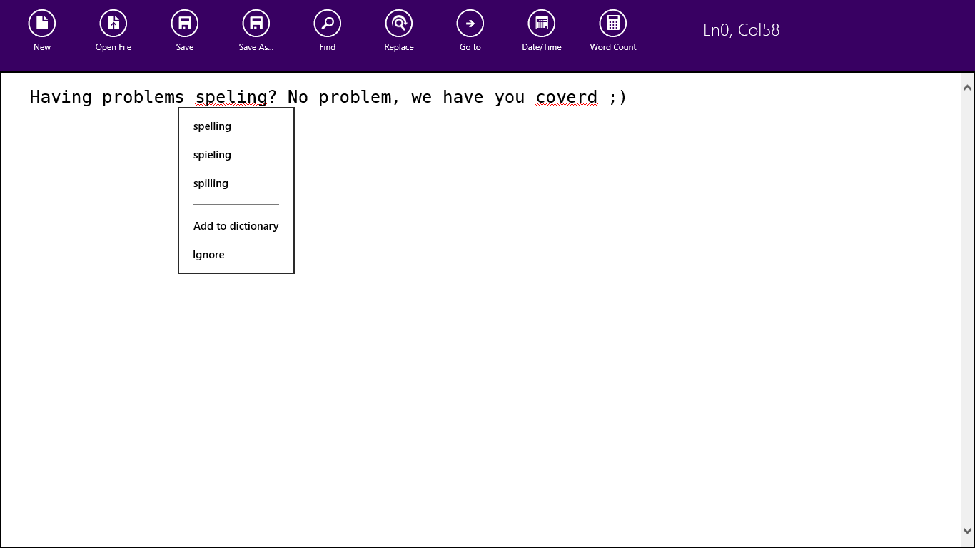
  • Spell check
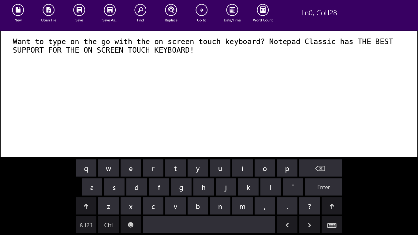
  • GREAT support for touch
  • Awesome snapped view

For developers

This application is a C#/XAML based Windows Store app which implements the MVVM pattern using AtomicMVVM. It really started out as simple an app as it gets, open text file, edit text file, save text file. However thanks to the great feedback in the store and on the Apptivate.ms site I have added many more features. I personally think it is now one of my complex Windows Store apps! The idea to build it was because I just needed a simple tool and this would fit the bill.

Notepad Classic makes use of the Callisto library. Notepad Classic makes use of icons created by the awesome (& free) Metro Studio 2.

Videos

Screenshots

Comments

2
esskar Dec 6 '12 at 8:32
nice one. we need more of that!
1
dahln Dec 5 '12 at 21:44
Probably the best touch friendly notepad app I have used on Windows 8.
1
Ankit Dec 5 '12 at 19:04
Simple and Elegant. You can provide a Reset button for settings reset to default if I messed up with them. I have noticed that Undo does not works for undoing Date and Time added through app.
1
Sandeep V Dec 1 '12 at 13:17
I find it useful app for touch device, Good work.
1
AJohn Nov 30 '12 at 10:48
Very nice little tool.
3
MBZ Nov 26 '12 at 17:43
I have seen better apps already on store. like Quick Note. However, this seems very simple and "classic".
Robert MacLean Nov 26 '12 at 17:51
I would love some more constructive feedback if you feel like sharing - why the others are better? (btw did you download it, the screen shots etc... are a little out of date)
MBZ Nov 26 '12 at 18:33
Sure. They provide a list of recently opened files which is quite handy. They also allow me to save in various formats (ASCII, UTF8, ... which is a "Classic" feature).
Robert MacLean Nov 26 '12 at 20:59
Those are good ideas, thank you for taking the time to help me understand better. The MRU is interesting idea and I have been trying to figure out how to do it in the UI and haven't found a way that make sense yet. Notepad Classic does support saving in various formats, however that the format that is used is the format it is opened in (we detect it and ensure it stays in it). Would you like the ability to change the format?
MBZ Nov 26 '12 at 22:19
no problem at all. actually my main language is not English and changing format is very useful for me sometimes.
1
JBurace Nov 14 '12 at 21:47
Thanks, I dislike bloated software. This'll help a lot.
1
Remy Nov 13 '12 at 9:59
Are you planning some syntax highlighting? Does it work with ANSI and UFT strings?
Robert MacLean Nov 14 '12 at 6:37
Yeah, it works great with UTF (did all the work on that for the latest release). ANSI should be fine too (trying to find a decent test data set to confirm). No plan to do syntax highlighting.
Robert MacLean Nov 15 '12 at 5:39
Found some ANSI test data last night, so next release will have great ANSI support :) There were some bugs with ANSI in current release the test data helped fine.
1
Abhinandy Oct 28 '12 at 5:35
Great app good idea....
3
Amal Dev Oct 6 '12 at 6:23
Nice simple app. I would like the menu to auto hide like all the other windows store apps and it will be more helpful if you can incorporate undo/redo functionality
Robert MacLean Oct 6 '12 at 7:22
Great ideas - will be using them in the next update!
KevinM1 Oct 6 '12 at 20:58
Can the menu have different colors? Black seems a bit stark for a "Don't call it Metro" app. Something sage green or dark aqua may look more like Windows 8.
Robert MacLean Oct 7 '12 at 11:17
Agreed completely - next build will use the same purple as the icon. Looks really good, if I say so myself - but it is all thanks to you for the GREAT idea!